answering your Qs
I received a number of questions regarding the editions from our last email so I will summarize the most common questions below:

How many prints are there?
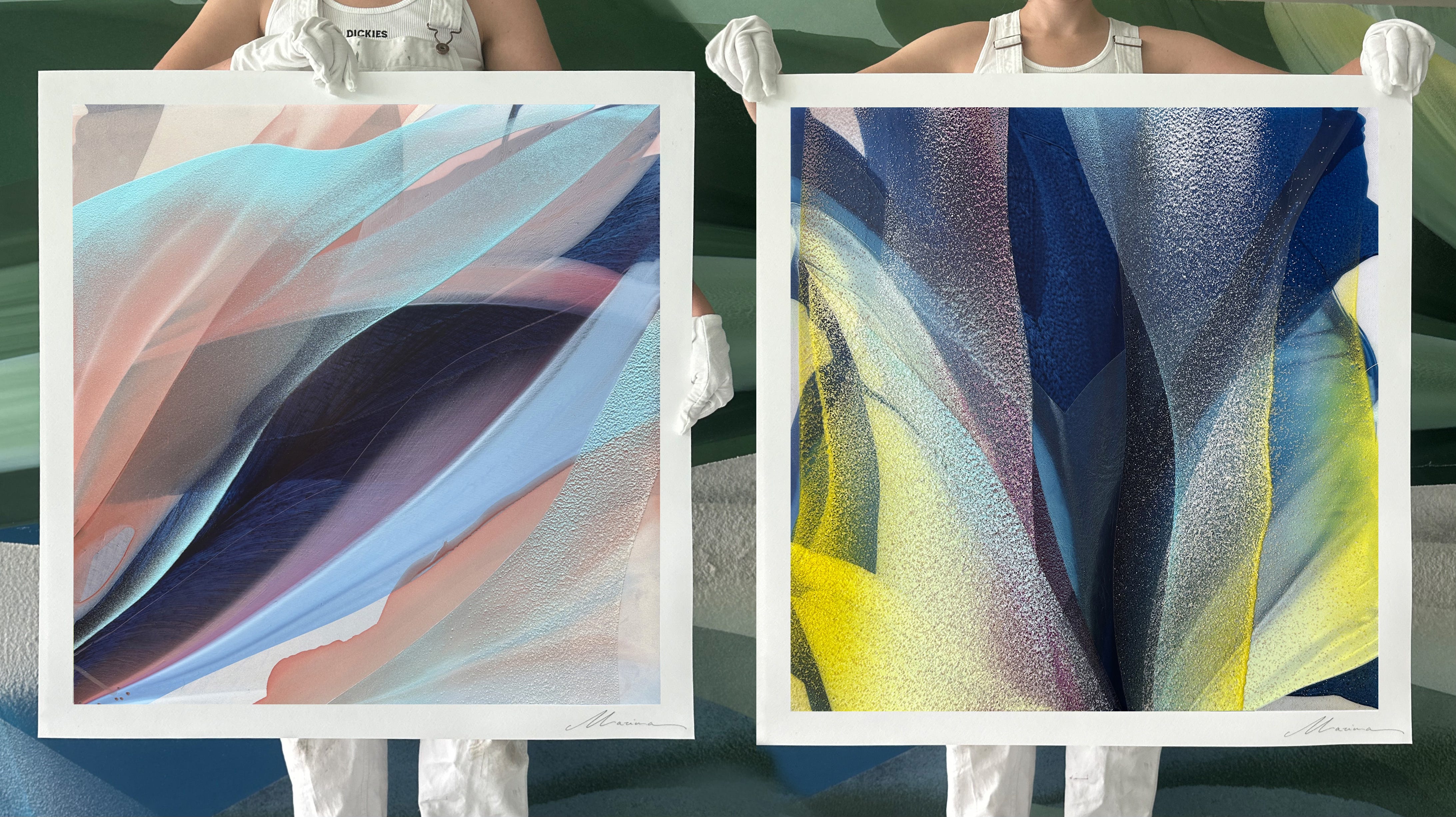
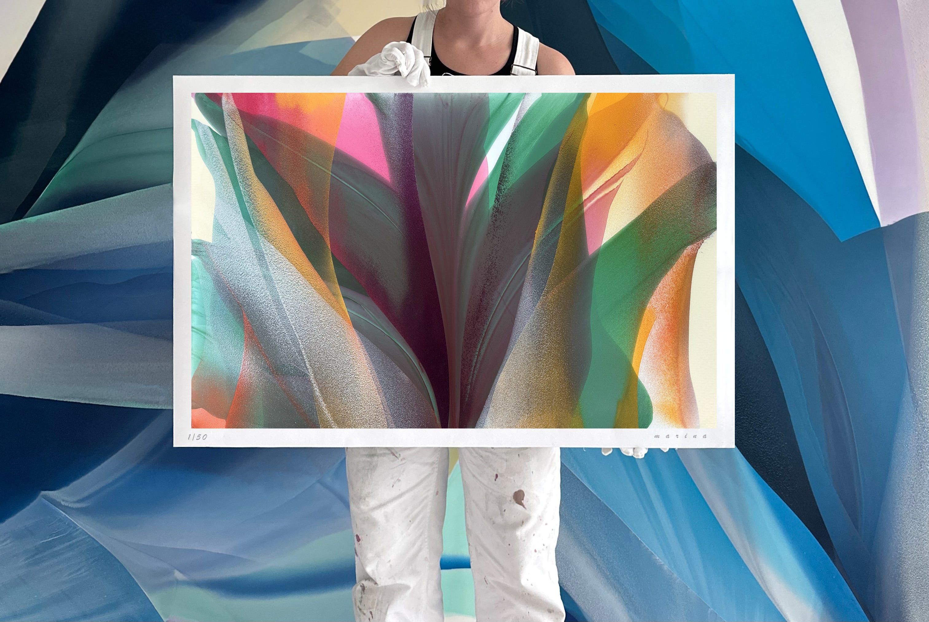
In this collection, we’ve got 10 unique works, in variable sizes. The website was recently updated with images of them all, so you can scroll a full preview here.
Can I pick the orientation?
Yes—and this is new! In the past I haven't offered this, but every now and then I finish a work that truly works both horizontally and vertically (and I can’t decide which is better), so I’ll let you decide. :) This option is available only for select pieces in the collection—three, to be exact. You can choose vertical or horizontal, and I’ll sign it according to your preference. One vertical and one horizontal still belong to the same edition, so if 25 collectors choose vertical and 25 choose horizontal, it’s still a single edition of 50
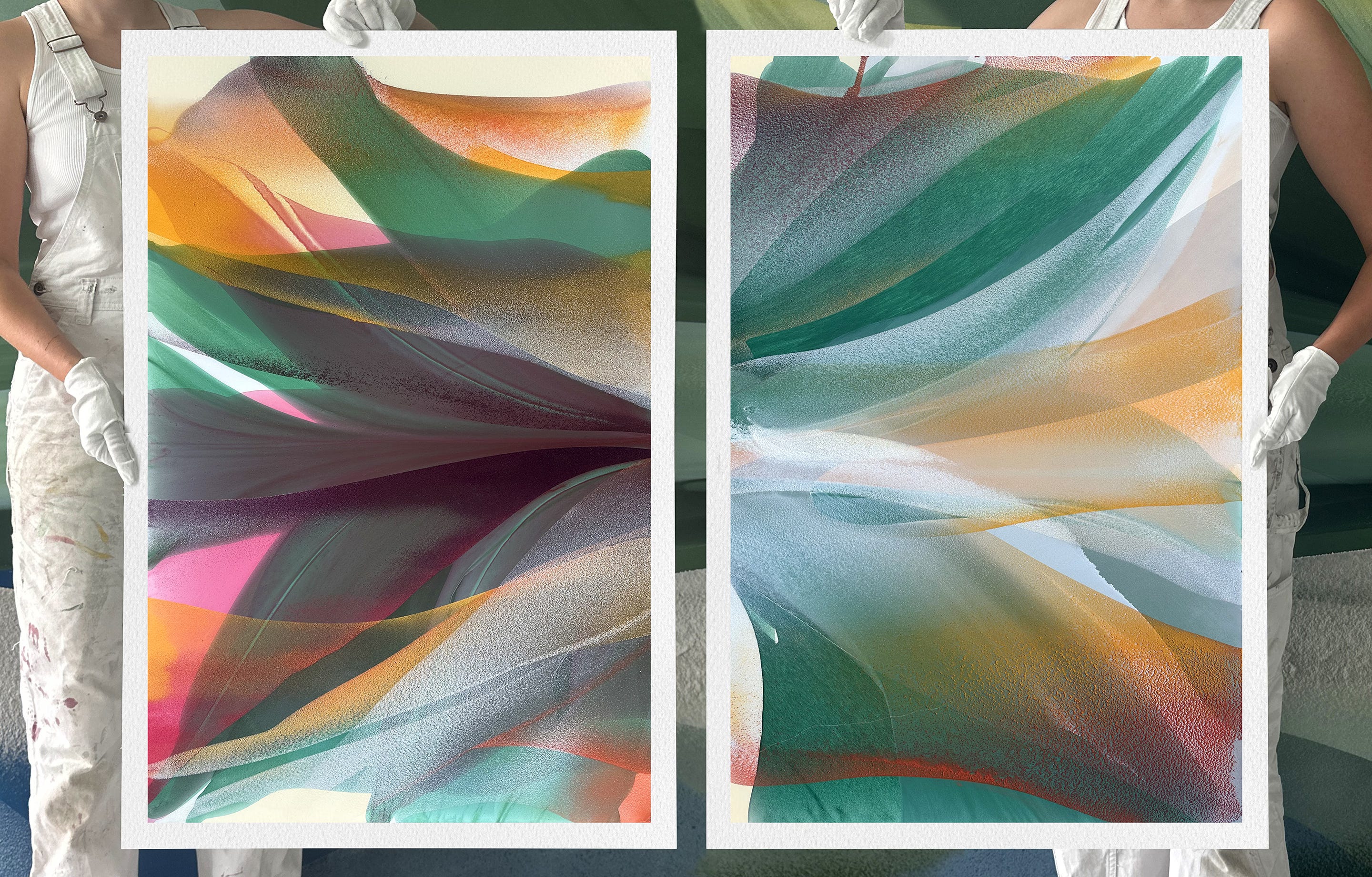
Jungle I &II
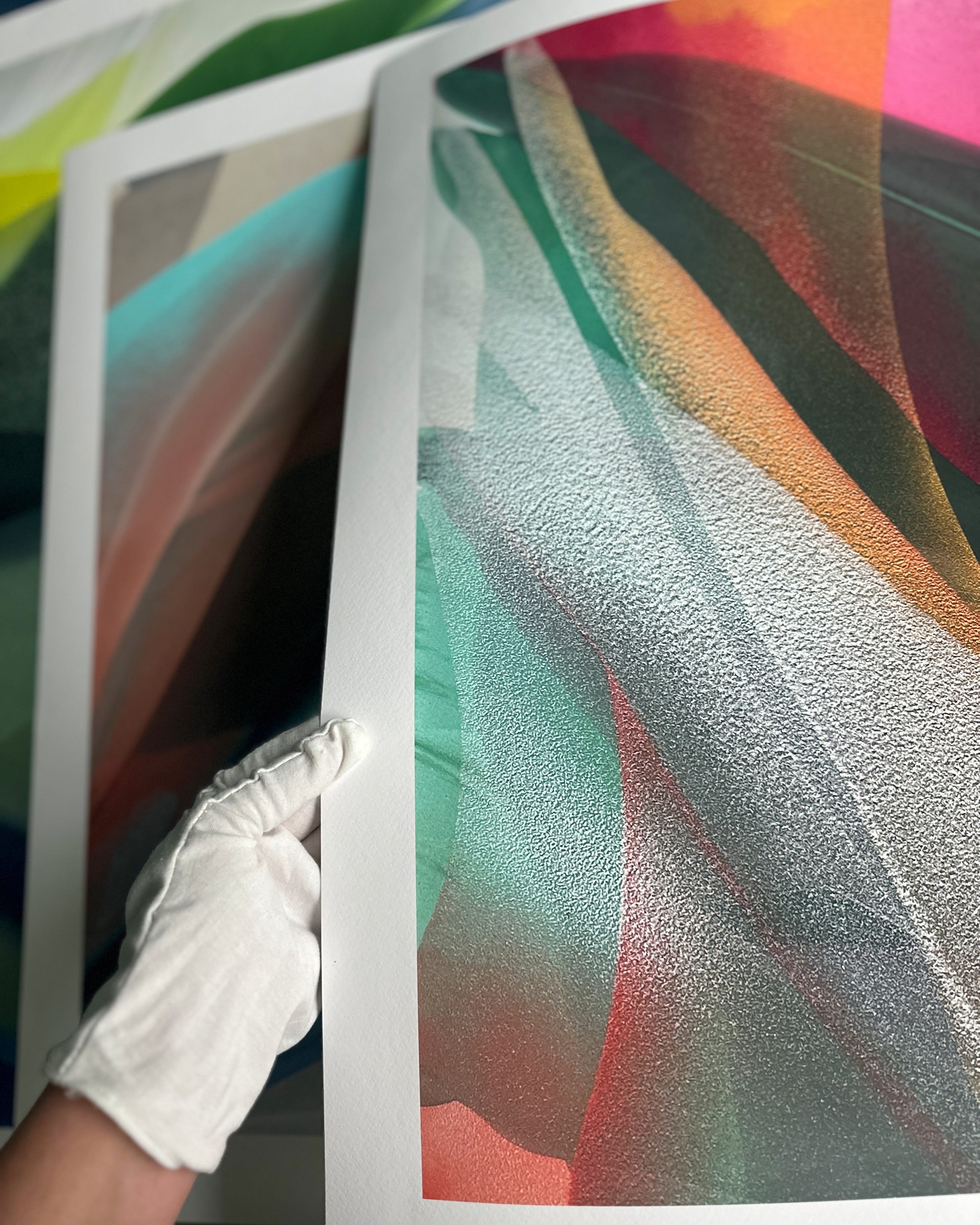
Do the prints have texture like the originals?
The paper used for the prints has a subtle texture, like watercolor paper, but the prints themselves don’t include the actual sand texture found in the paintings. The illusion of texture, though, is very intentional. My paintings are photographed to preserve slight surface shadows that emphasize the sand; traditional art photography usually removes all shadows, but I intentionally keep a bit of them. Those shadows give the sand a sense of dimension, so from a few steps back you still see volume and texture like I originally intended. This approach was refined through plenty of trial and error—whenever we used standard lighting, the sand looked flat and lost its character—so we developed this method to truly capture the piece’s depth.
"In the series of paintings titled 'Jungle' I wanted to capture that feeling of heat and warmth—like being immersed in an ecosystem that feels both dense and limitless. Technically speaking, colors like yellow and orange are usually the hardest, because the transparent paint has a tendency to turn muddy fast. Warm‑toned sand behaves differently: the grains interact with the layers beneath through optical mixing, sitting beside the greens instead of forming another translucent hue on top. I use tones of coral, orange, and deep yellow to lay very thin veils over the dominant greens, hoping to create a sense of light, a depiction of something scattering and intangible with a material that’s inherently solid. I like that dichotomy, both in practice and in the idea itself."